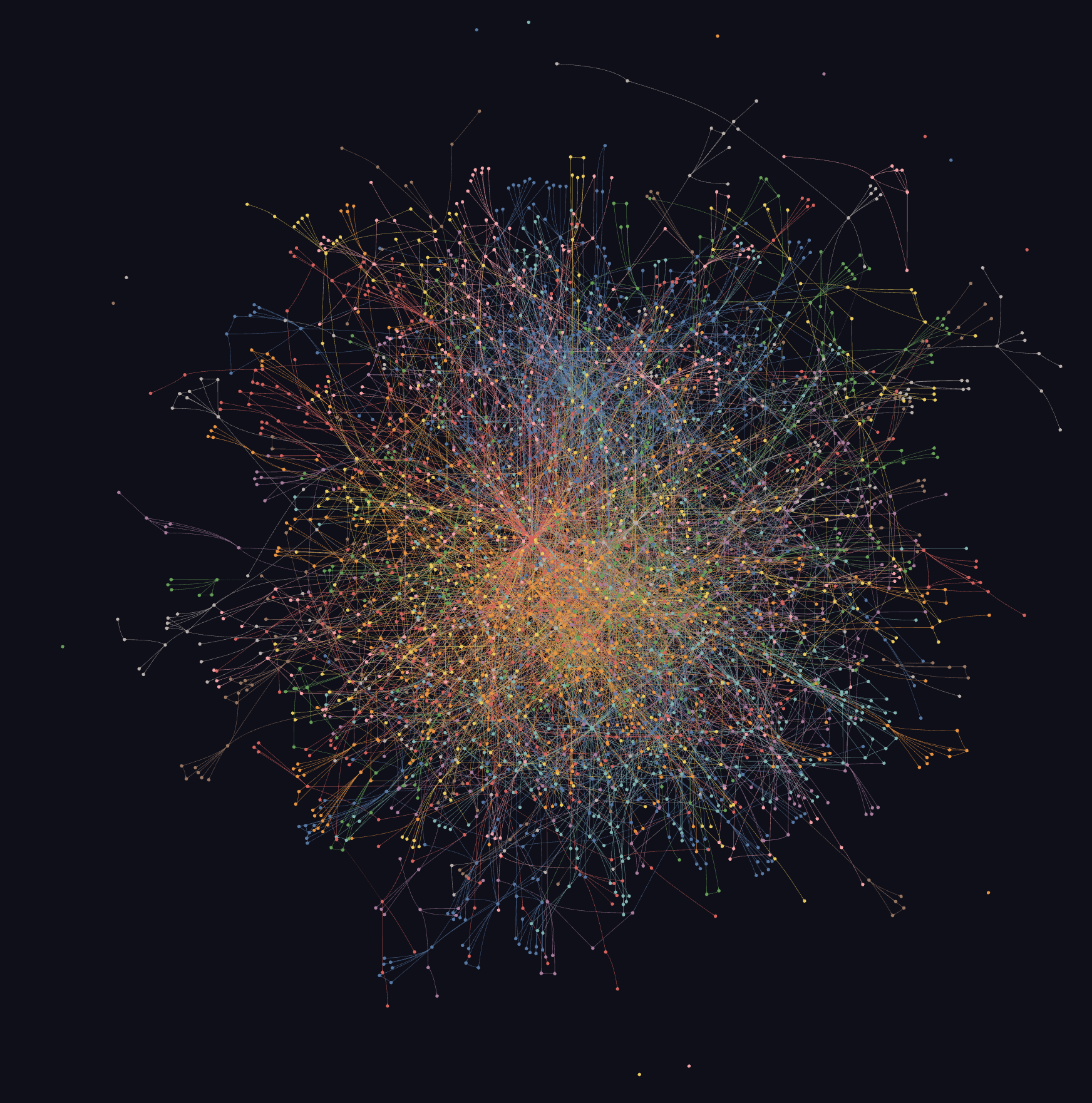
First: graphing the conference reveals structure you cannot reliably see by reading sessions one by one. Once 1,146 sessions, 444 slide decks, and 323 transcripts are turned into nodes and edges, repeated patterns become visible: which products sit at the center, which protocols connect otherwise separate systems, which themes cluster together, and which ideas show up across product, security, data, infrastructure, and partner talks.
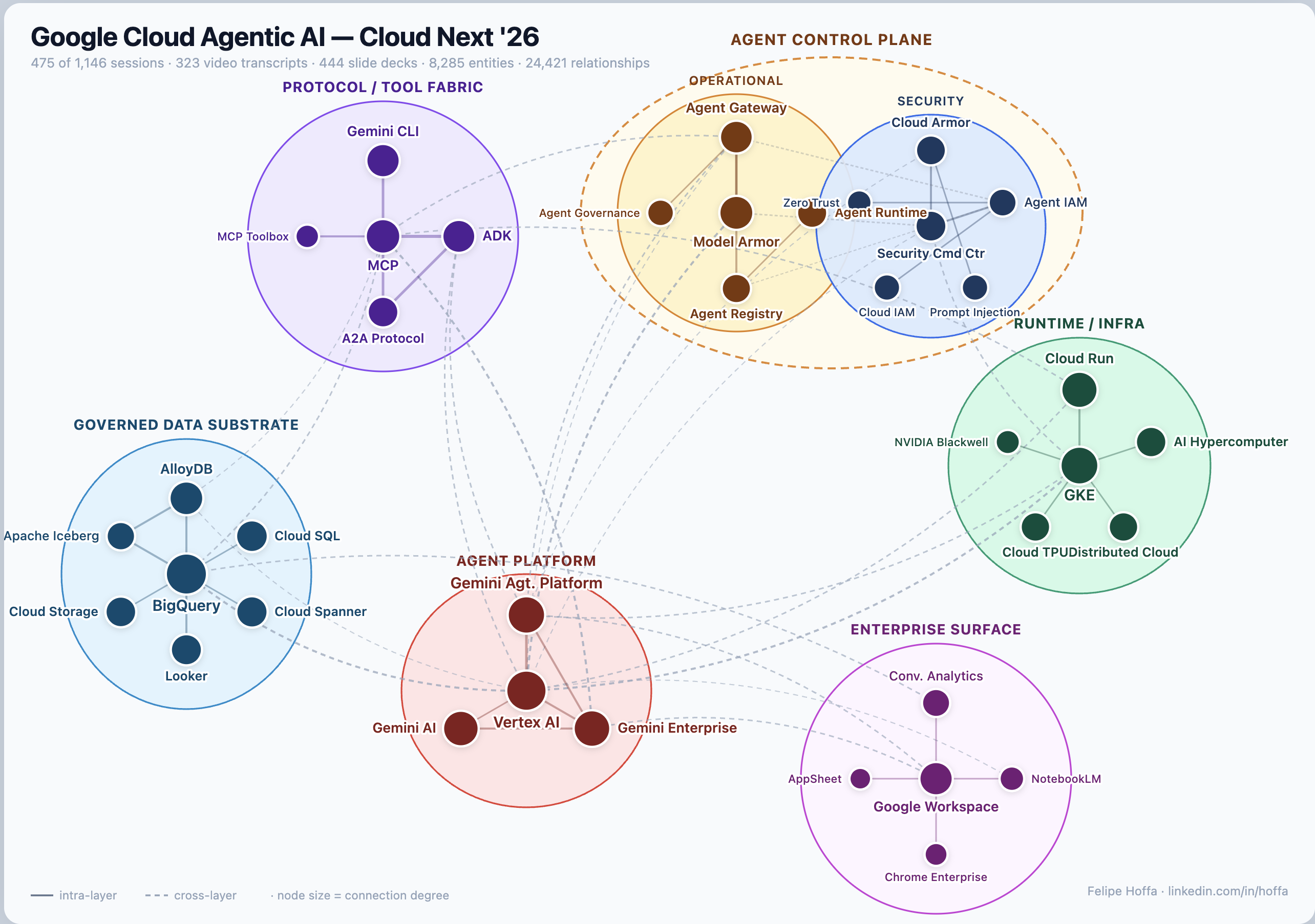
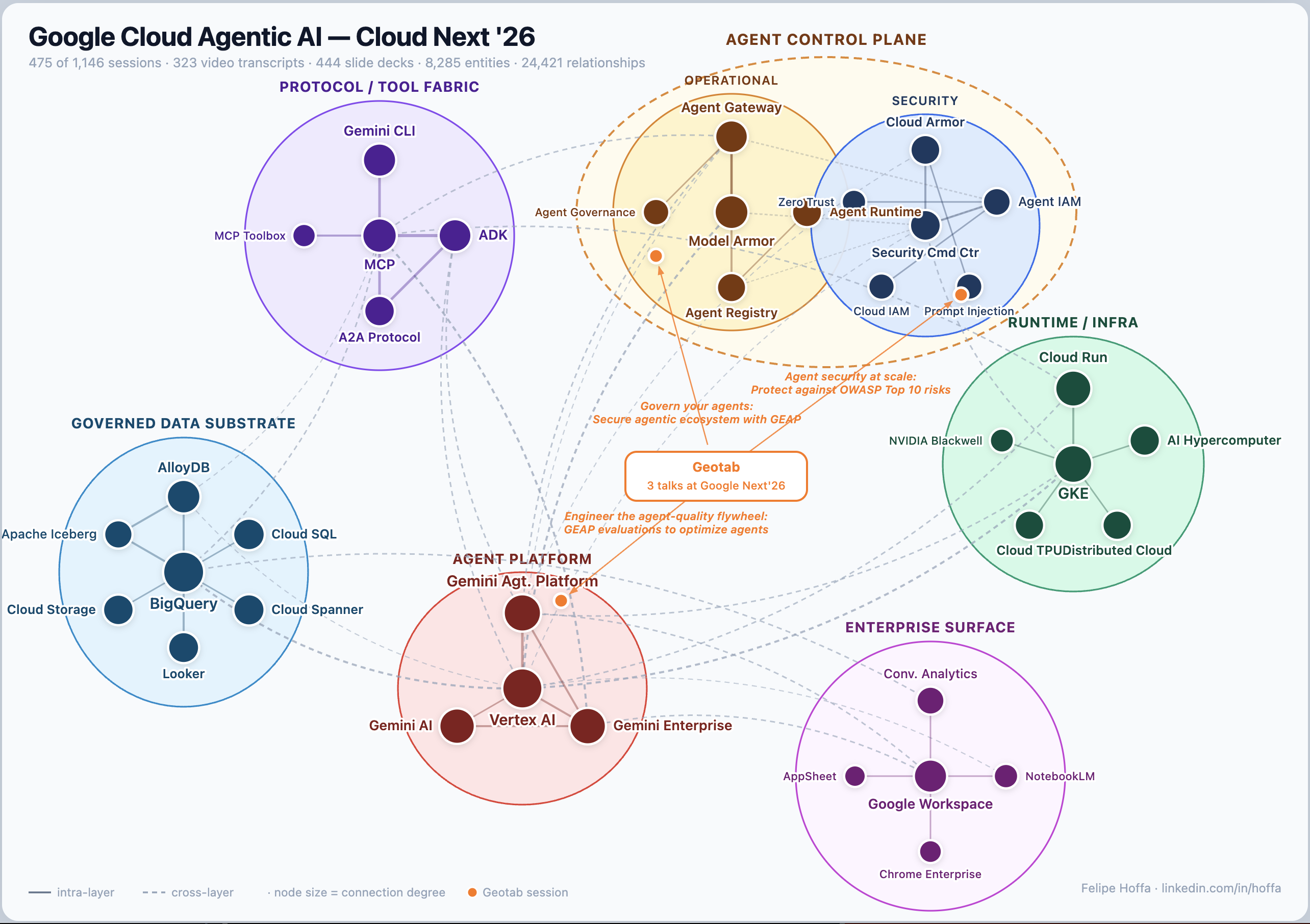
That is where many of the strongest insights in this story come from. MCP starts to look like connective tissue. BigQuery starts to look like a governed substrate for AI systems. Cloud Run, GKE, security controls, evaluation loops, and enterprise data products start to read as parts of the same architecture.
Second: building the graph was fairly straightforward. Cleaning up the conference corpus was the hard part. The source material was messy: decks, transcripts, session pages, repeated product names, overlapping abstractions, and different levels of specificity. graphify made the workflow feel direct: feed in the corpus, extract grounded entities and relationships, and simplify the result into a graph that a human can actually read.
The graph also shows what Google seems to believe will matter in production. The center of gravity is a working stack: agents connected through MCP and A2A, grounded in enterprise data, deployed on managed runtimes, evaluated continuously, and wrapped in governance, identity, and security controls.
If you want to test that thesis yourself, browse the session explorer, or open the full interactive map and follow the edges yourself. The graph, the map, and the session index feel like the right publishable artifact here, without redistributing downloaded slides or transcripts.
One encouraging part of this project is how manageable it was. It took a few steps, and Graphify made the workflow pretty approachable.
A future attendee could use a graph like this during the next conference to decide which sessions to prioritize, spot the hubs everyone is converging around, and follow emerging ideas across tracks in real time. It works well as a retrospective, and it would be even more useful live.
Read and discuss this knowledge-graph story on LinkedIn →